 |
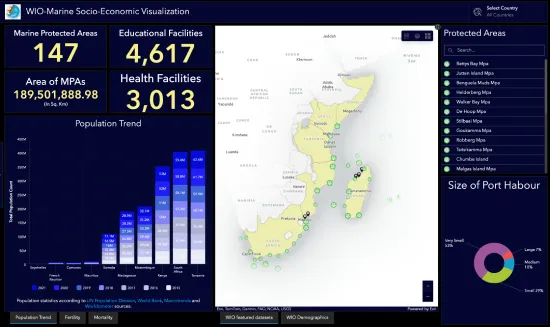
The developed WIO-MPAs Socio Economic dashboard enables users to quickly gain insights into a number of aspects of the marine environment data sets via a series of visualization techniques. Doing so enables users to not only present the data set, but also explore it as a means to knowledge discovery and further insights for timely and effective decision making. Developed within the ArcGIS Online environment, the dashboard enables users to visualization specific data layer(s), that can be country or region specific, and analyze trends for decision making purposes. The visualization includes charts, graphs and maps and frames depicting specific numerical values. Population trends are depicted using an interactive time slider. |
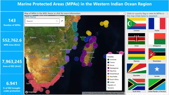 |
The Western Indian Ocean Marine Protected Area dashboard is a tool that visually tracks, analyzes and displays key metrics and data points extracted from the wealth of insights contained in each of the country chapters. The dashboards provide an accessible way to see and understand trends, outliers, and patterns in the MPA data at a country and regional level. The dashboards contain different kinds of maps, performance indicators, narratives, graphs, charts, tables, images, tree-maps and many other visualisation elements that will enable you to gain insights about the MPAs. |